POR 318 Draft

Iteration

POR-318-cover

Namita got in touch about making a draft for the new model during the vacations; I took out time during internship to finish it. This time, I worked as a consultant rather than an intern, which was different in that communications were more formal and through mail rather than in-person.

The handout was pretty much a tweaking of images within the set template. It will probably be sent out along with the projectors or given at the first training session. I’m looking forward to hearing how it is received, especially by the mediators and VRPs.

About two months later

Uncategorized

Internship’s been all I’m upto, I’m enjoying it thoroughly. However, I’ve missed the deadline for improving my grade.

Anyway, it seems DG too has taken a break on this, I haven’t heard from them since.

Last couple of days at studio, we had some discussions about student projects gone and to come. I’d like to complete this project within the vacation, make the improvements based on jury feedback and perhaps get some for the field.

Print Considerations

Production

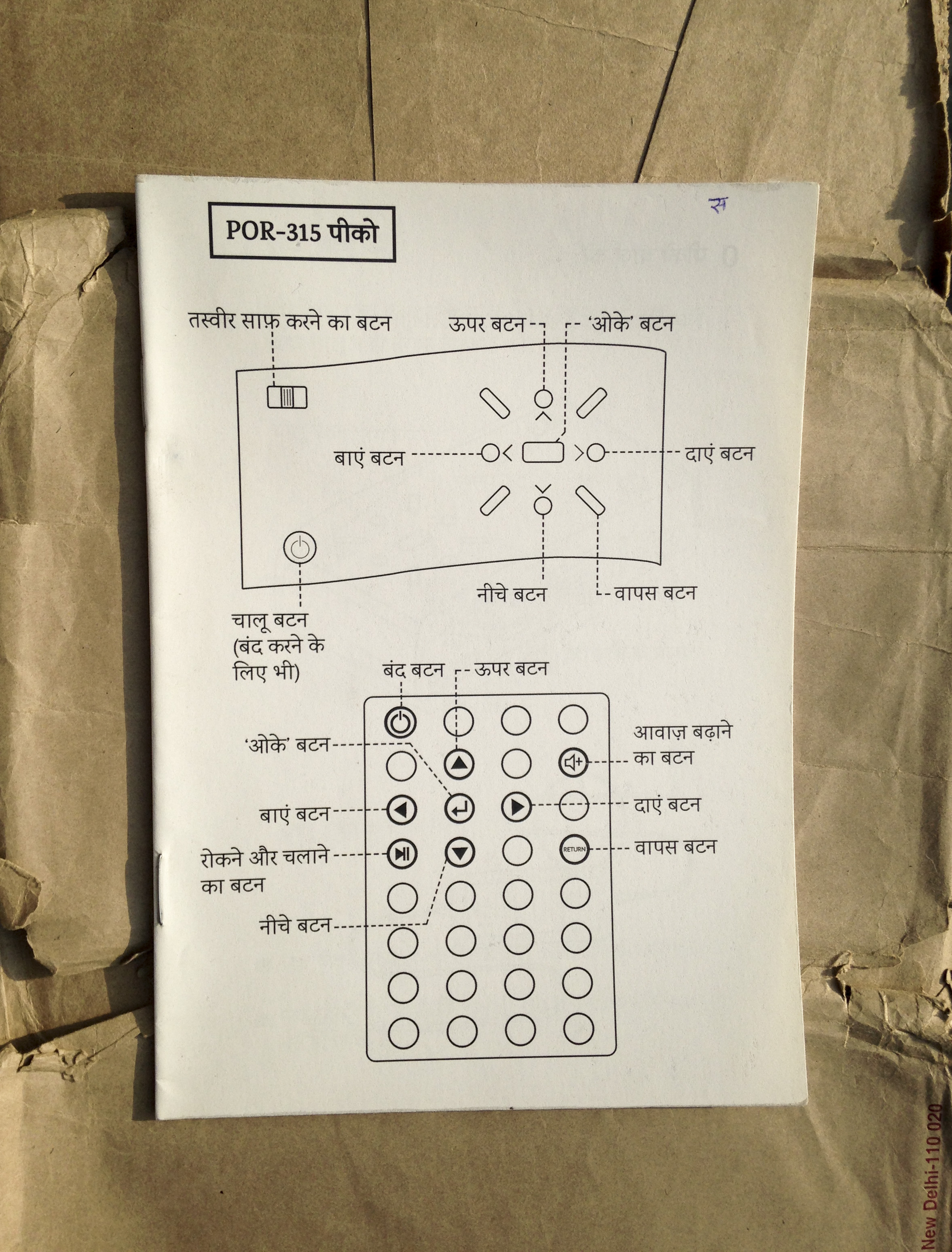
So DG have decided to print the final draft I made for the POR315 model (there are about 850 projectors currently in Bihar).

They talked to an offset printer, who suggested 130gsm as a good weight for durability and suggested lamination as well. Unfortunately, I haven’t been able to meet the printers – they visit unplanned.

After a few meetings, the printers presented some samples with a selection of papers based on the requirements.  At this stage, DG are considering getting an offset run of 500 prints.

POR-315sample_4 POR-315sample_5 POR-315sample_3 POR-315sample_2 POR-315sample_1 POR-315sample_0

They passed on the samples to me so that I can suggest one that works best. I showed the samples to Sadam and he gave some great pointers for choosing; might the handout be written on, say, for note-taking? how might they handle, carry, store it? what is the feeling / association the user may get from the paper (official/expensive/plain)? Eventually, I suggested the 300gsm matte cover with 130 gsm matte sheets inside.

I want to at least make the line thicknesses uniform before they print but it seems tough – internship means I have small slots of time and DG is sure about printing these within the week. Sadam showed how I can make line thicknesses similar digitally using brushes and work paths. Khyati also showed a simple method for simulating pen lines on illustrator. I hope I can find a way to fix this before they print!

Semester Jury

Uncategorized

So the jury happened!

As always, I would have preferred to start working on the presentation much earlier than I did. The preparation for the presentation was really rushed and was completed just minutes before the jury actually began; so there’s a lot to add and improve...

What was great about this year’s jury was that the panel really heard out each of us and were very interested in the work we were showing. They were much more appreciative than we expected and that was encouraging.

Some of the feedback I got was :

Shilpa – It’s good to work in these sectors, not enough students and designers are doing that. It’s a great opportunity that you got and the exposure to rural agriculture in Bihar itself is valuable. The diligence with which you worked shows through.

Rupesh – You need to look at the larger picture and be critical. Try and question the system at work – is this appropriate?

Nidhi – This is mind-boggling! (referring to the fact that the ‘play’ symbol was the least recognizable during user testing) Work on illustration styles.

Pre-Jury Guide Meeting

Uncategorized

I met Tarun with my prototypes ready and my chart on the soft board. I took him through the latest progress and he gave some pointers :

  • Organize sheets and mockups for ease of viewing.
  • Make line weights uniform for consistency.
  • Quickly try out some typographic style treatments.

We discussed how to communicate the project – the context and various checkpoints of the process – to the jury. Finally, he said this –

“Until now, content was in the client’s hands; the visual design stage is your responsibility. How far you go to ensure that the content is communicated in a way that is functionally and aesthetically appropriate is your call.”

That makes sense to me – to a large extent, deadlines and pragmatism have driven me so far, which helped in many ways; it would be good to look at it through a more idealistic perspective now, as a graphic design student.

draft 2

Iteration, Validation & Feedback

A simple draft, intended to be sent by the 6th of March but still in progress.

Self-doubt regarding the skills being applied, the aesthetic effect and hesitance to do brunt work had to be dealt with.

This draft largely outlines the content so that the work hereon would focus on visual aspects. In the ideal scenario, I would’ve gotten to some serious design exploration for this already. You can have a look.

End of Week 8

Uncategorized

What I am yet to get to :

My personal motivation hereon is to explore as much as I can – visual treatment / illustration style, format, layout, slide design, scoresheet design, paper, printing (Nandini’s remark about wanting to be expansive and exhaustive as a student may be right after all)

Articulating many things in a presentable manner is yet to be done – such as work done on the content, how we arrived at the current data but right now there is a strong need to fulfill the client’s deadlines (18th, 22nd).

The jury is an important step in getting ideas, critical feedback and improving the work; another deadline coming up after it to get the video slides ready for the TTT.

Looking forward.